Dimensional Modeling 101
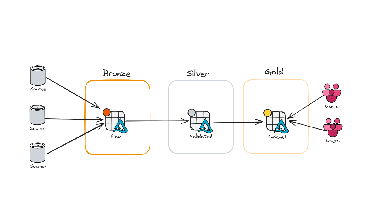
In my last post, we talked about the medallion architecture - how to layer your data into Bronze, Silver, and Gold so things are cleaner, faster, and easier to manage.
But here’s the catch: you can build the optimal pipelines, a performant Lakehouse, and governance rules tighter than Fort Knox… and your reports can still suck if the data model is wrong.
Slow reports. High capacity usage. Dashboards timing out. Most people point fingers at Power BI - but nine times out of ten, the real culprit is a poorly designed data model.
So how do we fix it? How do we build something that performs, scales, and doesn’t drive users back to their old friend Excel?
Start with Kimball
Ralph Kimball is widely regarded as the godfather of modern data modeling for analytics - not because he invented databases, but because he understood something many people still overlook:
A good data model isn’t just technically correct. It has to make sense to the people using it.
Before Kimball, most models followed the Inmon/Third Normal Form approach. Great for transactional systems (where you care about writes), not so great for analytics (where you care about reads). Kimball flipped the script and said: keep it simple, keep it intuitive, and the whole system runs better.
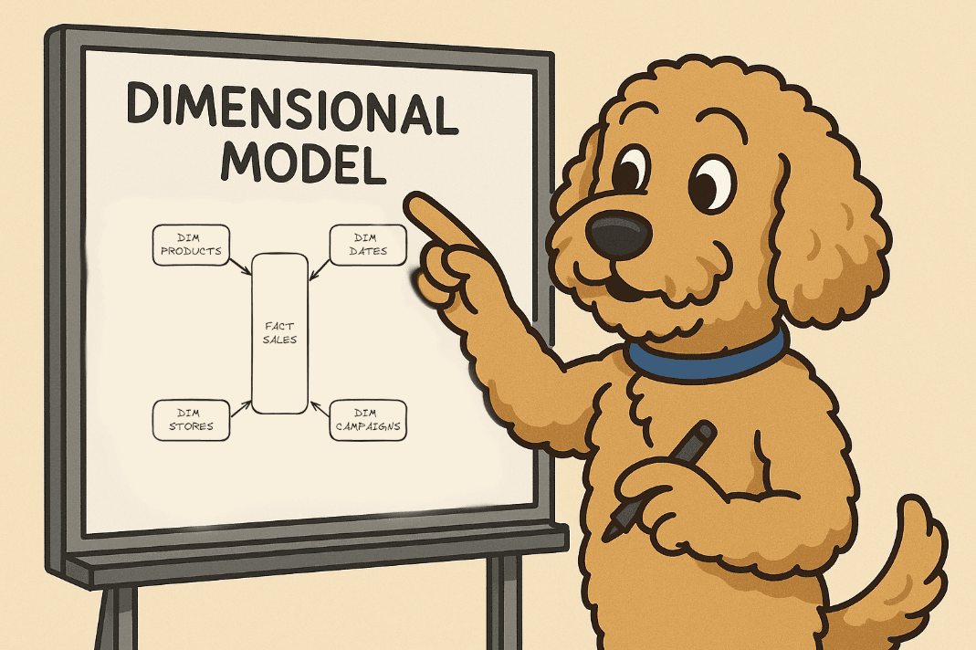
The Heart of the Dimensional Model: The Star Schema
Fact Tables: The Core of Measurement
Fact Tables are where your aggregations live. Sales, revenue, units sold, discounts, returns - if your business measures it, it belongs here.
Each row = a real-world event at its lowest grain. That could be a single transaction at the register, a return at the service desk, or an online order being shipped.
A fact table always includes foreign keys to the dimensions around it - customer, product, date, store, promotion - so you can answer questions like:
Which products sell the most by store?
Which customers are most profitable?
Which promotions actually drove traffic instead of just margin loss?
And because fact tables are massive, they must be centralized. If every region or department builds their own version of “sales,” you’ll end up with different numbers for the same metric - and good luck explaining that to the CFO when the dashboards don’t match.
Not all facts are created equal, though. Here’s the quick rundown:
Additive: Can be summed across any dimension (sales amount, quantity sold).
Semi-additive: Can be summed across some dimensions but not all (inventory balances add up across products, not across time).
Non-additive: Ratios and percentages (gross margin %, conversion rate) that need to be calculated, often in the BI layer, from their additive building blocks.
Keeping these distinctions straight will save you from half the reporting headaches that developers run into when the “same metric” looks different in finance vs. operations.
The Three Flavors of Fact Tables
1. Transaction Fact Tables
Grain = the individual sale or return.
One row = one receipt line.
Perfect for basket analysis, customer journeys, or SKU-level profitability.
2. Periodic Snapshot Fact Tables
Grain = time period (day, week, month).
One row = “what did sales or inventory look like on this day?”
Perfect for trending KPIs, tracking store comps, or monitoring daily inventory.
Even if no sales happen in a store, you still log a row- otherwise your dashboards show gaps.
3. Accumulating Snapshot Fact Tables
Grain = process with a defined start and finish (e.g., order fulfillment, supply chain, loyalty enrollment).
One row, updated as milestones are hit - order placed, shipped, delivered, returned.
Unique because it’s updated instead of just appended.
Perfect for tracking online orders, click-to-delivery times, or end-to-end supply chain visibility.
Together, these three types cover almost every analytic need - from SKU-level margin analysis to enterprise-wide sales trends.
Quick Note on Nulls (and a personal pet peeve)
Fact table measures can handle nulls just fine - SUM, COUNT, AVG all behave. But foreign keys? That’s a hard no. Nulls there break referential integrity.
The fix: create an “Unknown” row in your dimension with a surrogate key (often -1). Use COALESCE(key, -1) on load. That way, if something breaks upstream, your report shows “Unknown” instead of silently dropping rows. Plus, it’s a giant neon sign to the data engineer: something went sideways.
Dimensions: Giving Numbers Their Meaning
If fact tables are where the aggregations live, dimension tables are what make those numbers make sense. They turn “$10,392.57” into “Total Net Sales on Sept 1st, 2025 was $10,392.57.”
Every dimension has a single primary key, which shows up as a foreign key in your fact table. That’s how you join a row of sales data to its customer, product, store, date, or marketing campaign.
Unlike fact tables (which are tall and skinny), dimension tables are usually wide and flat - packed with descriptive attributes that people actually filter and group by. Things like:
Product name, brand, category
Store region, format (mall kiosk vs. superstore)
Promotion type (BOGO, clearance, loyalty points, Labor Day Sale that extended are still happening)
Customer demographics or segments
Dealing with Codes and Flags
Notice what’s not helpful? Cryptic codes and flags. “PromoType = C3” column won’t mean much to your business user. Instead, dimensions should spell it out: “PromoType = Clearance.” If your source system insists on giving you codes, expand them into human-friendly descriptions in your dimension table. Keep those keys in your fact table to keep it nice and tight.
Drilling Down and Hierarchies
One of the main reasons dimensions exist is to make analysis intuitive. Kurt Buhler wrote a fantastic blog about the 3, 30, 300 rule I highly recommend reading. Business users should be able to drill down to their desired dataset in under 30 seconds, and get to their detailed information in under 300 seconds.
Sales by month → week → day
Revenue by region → store → aisle
Inventory by category → brand → SKU
Good dimension design makes this seamless. You don’t need to hardcode every path; as long as the attributes are there, users can explore naturally.
Most dimensions also support more than one hierarchy. Examples:
Date: Day → Week → Fiscal Period, or Day → Month → Year
Product: SKU → Category → Department, or SKU → Brand → Line → Group
The takeaway? Don’t over-engineer the drill path. Put the attributes in the dimension table, and let users choose the path that matches their business question
The Calendar Date Dimension
Almost every fact table connects to a date dimension - it’s how you move through time in your analysis. Without it, you’re stuck writing messy SQL to figure out things like fiscal periods or holidays (and trust me, you don’t want to compute Easter yourself).
A solid date dimension comes preloaded with all the attributes people care about:
Day, week, month, quarter, year
Fiscal periods (because finance always has its own calendar)
Holidays and special events (Black Friday, Cyber Monday, Easter, etc.)
Week numbers and month names for easy grouping
To make partitioning easier, the primary key is often a smart integer like 20250905 (YYYYMMDD). But here’s the important part: business users shouldn’t rely on that key. They should slice and filter using the attributes - month name, fiscal week, holiday flag - because that’s what actually makes sense to them.
And don’t forget the edge cases:
You’ll need a special row for “Unknown” or “TBD” dates.
If you need more precision, like time of day, you can add a separate time-of-day dimension (shifts, day parts, hours).
For detailed timestamps (like order created at 10:42:17 AM), just keep the raw datetime column in the fact table - no need to overcomplicate it.
In retail, one of the most common calendar setups is the 4-5-4 model. Instead of neat calendar months, the year is broken into quarters where the first month has 4 weeks, the second has 5 weeks, and the third has 4 weeks. This design keeps weeks aligned to the same day of the week year over year—so a Saturday in week 32 this year is still a Saturday in week 32 next year—making it much easier to compare sales, traffic, and promotions across periods. It also ensures holidays and seasonal events line up consistently, which is critical for planning, reporting, and year-over-year comp analysis in retail. Here is an example below:

Role-Playing Dimensions: Same Table, Different Hats
Sometimes the same dimension needs to show up more than once in a fact table - just playing a different role. That’s where role-playing dimensions come in.
The best example is the date dimension. A single transaction might reference multiple important dates:
Order Date → when the customer placed it
Ship Date → when it left the warehouse
Delivery Date → when it arrived at their doorstep
Return Date → when it came back to the store
All of those link back to the same date dimension table - but each plays a different role. Instead of building four separate date tables, you just reuse the one dimension and give each instance an alias (OrderDateKey, ShipDateKey, etc.).
Role-playing isn’t limited to dates, either. You might use the same employee dimension to represent both the cashier who rang up a sale and the manager who approved a discount. Or the same store dimension to represent both the selling location and the return location.
Wrapping It Up
Dimensional modeling is more than just a way to organize tables - it’s the foundation of an enterprise data model. Get this part right, and everything else - pipelines, governance, dashboards, even AI - sits on top of a structure that’s consistent, scalable, and built for the business.
A strong dimensional model doesn’t just deliver faster queries and cleaner reports. It also sets you up for optimized AI insights - because models trained on clean, business-ready data actually produce results you can trust.
And most importantly, it keeps your end users where they belong: in your BI environment, not back in Excel. When reports run fast, metrics stay consistent, and the data model “just makes sense,” people stop exporting and start exploring. That’s when your data platform shifts from being a cost center to becoming a competitive advantage.